Howdy folks, Yoni here from GeekSlam!!
You have probably noticed the incredible lack of posts on this website. This is because we have been working on GeekSlam 2.0 to launch in April of 2013.
This website, GeekSlam on Blogspot was launched in April of 2012, and we wanted to do something special for the 1 year anniversary. We will be officially launching the new website sometime next month, with some special features:
New domain! We chose GeekSlam.co.uk since the site is mostly UK based and run.
Awesome Site! We have been working on the site for 2 months, ironing out bugs, making the site look nice yet have a great UI and everything inbetween.
We are always looking to improve the new site so please have a look at it and let us know. It's on WordPress which is way better than Blogspot. We'd love to hear your suggestions for which plugins to install, because after all the site is devoted to the readers!
Thanks!
Yoni
Monday, 11 March 2013
Monday, 7 January 2013
Ashley's Thoughts On The Redstone Update
Redstone. Every gamer has heard of it. Probably one of the biggest mechanics in minecraft. But in the upcoming 1.5 update, titled the redstone update by mojang, has got the redstone community worried. In this article im going to explain my thoughts on the updates that are coming to redstone and if i think that they will be a good idea.
So first of all, probably the elephant in the room here is the BUD switch. The BUD is a bug that is considered by many a feature and it detects when a block near the BUD is updated, and it gives a pulse. This is primarily a glitch in the game that was discovered by etho (ethoslab) and will almost definatly be removed in this update. The BUD has been in the game for a long time and is used in a lot of circuits. I believe that this should either be kept in the game or implemented properly into the game with a new block or special type of piston.
The very laws that govern redstone are going to be changed, making it easier for new users to "learn redstone." I think that this could break every circuit out there and some worlds might even get corrupted in the new update! The redstone rules have never changed and shouldnt because lots of people have worked to learn it and will have to relearn it, even though some features (RS nor latch) are hard (RS nor latch) to understand (RS nor latch), but im not complaining, lol.
So those are my thoughts on why the redstone update might not exactly be an update for some people, and why learning redstone right now might not be the wisest decision
Thursday, 3 January 2013
Minecraft snapshot 13w01a
Hey guys, ashley here.
So its the time of year when christmas is gone and you still want presents, well this is a weekly present from mojang: a snapshot with all the current features of an upcoming update. In this post i will run through all of the features that jeb, dinnerbone, and the rest of the mpjang crew have added to minecraft in the first 1.5 snapshpt: 13w01a
The first feature is one that was promised at minecon, the daylight detector. The daylight detector is a solar panel style block that, when placed, will detect the light level and output a redstone signal with the level accordingly.
Another redstone block that was added is the comparator: a repeater style item that can be placed and, depending on the inputs from different redstone sources, it can either repeat a source or extend a source
If you are familiar with tekkit or ftb, then you will be familiar with a block called the hopper, this is now being brought to vanilla minecraft with the same name, but right now its a work in progress block and is probably aimed for furnaces
There are also new pressure plates, called weighted pressure plated, the more items thrown on a pressure plate, the larger redstone signal is sent. This is probably useful for key doors or adventure maps
A new ore has been added it, but to get it you will have to brave the dangerous nether to get it. Nether Quarts is an ore that is used to craft all of the new blocks and items.
So, these are not all of the features, but these are my favourites. I cant wait to see what map makers and redstone geniuses will do with these *hint hint etho hint hint sethbling hint hint* lol
Thanks for reading guys
Tuesday, 18 December 2012
Nokia Lumia 610 Review
What up guys, Gabe here. Today, I’m going to be reviewing the Nokia Lumia 610.
Oh who am I kidding, you probably already left if you don’t want to read
Hardware
The first thing you’ll notice about the phone is its rather simple design. It’s a plastic built phone with a faux metal band around the display with matching buttons on the right side, ala the iPhone 3g, and a 3.7 inch gorilla glass display running at 480 by 800.
On the right of the phone you have your volume rocker, power button and a two position camera button. The lock button takes some getting used to, particularly if you’re coming from a phone with a top mounted power button like I did. After awhile of use however, I’ve found the power button is in the perfect position, if a little too small. On the front of the phone, you have three capacitive buttons, Back, Home and Search, which are back lit in an off white colour.Whilst capacitive buttons are a great idea in theory, I often found myself activating them while playing games, recording video and typing in landscape mode.
On the back of the phone, you’ll find a black plastic panel made of a soft touch plastic,which unfortunately can pick up a fair amount of dust, as well as a plastic overlay for the camera and flash, a grill for the speaker and a small Nokia logo. The back panel can be slid off to change the battery and your micro sim if you want.
On the top of the phone, you simply have a Micro USB port for charging and synching with the Zune/windows phone software, a microphone for noise cancelling, a 3.5mm Headphone jack and a slot to attach a lanyard.
The phone itself has a fairly nice weight to it, which helps it feel more like a premium product, unlike some other lighter phones (cough Samsung galaxy ace cough cough), which helps make the phone live up to nokia’s reputation of very tough and durable phones.
The screen on the Lumia is rather nice. It runs at a fairly high pixel density, 252PPI, which while it won’t look that high res next to a retina display, look very high-res and only really looks pixelated when you are specifically looking for pixels. The screen is also very bright, capable of being read in sunlight and outside, however I found it difficult to use when it was dark.
The phonehas a very nice 1300 MaH battery, which can last the day with estimations by the phone of 24 hours or more. The memory management in tango most likely helps here, but I still can't help but this of the Nokia 3310.
Softwareand performance
 Thephone, like all of Nokia’s Lumia line, runs windows phone, specifically windows phone 7.5 (and will be upgradable to 7.8) tango, a variant that is design to run on low powered devices (500 MHZ processor, 256 MB ram etc.). The real big difference between mango and tango is that mango has stricter multitasking. Apps using over 90 MB of ram are automatically quit, and not all apps, IE Skype,will install on the phone. That said, a lot of apps will run on the phone withlittle to no lag, particularly compared to some android phones of the same price.
The operating system uses the metro or modern UI, which in short is a really nice UI designed around rotation and sliding of on screen items, minimalism and typography. The phone also has a few useful nokia apps, specifically nokia drive, a GPS app, nokia maps, an online map service, contacts transfer, a way to wirelessly transfer your contacts to your new phone, app highlights and nokia music, music app and wireless streaming service. Additionally, you can download a few more nokia apps, such as camera extras, from the marketplace.
The nokia lumia 610 has 256 MB ram 500 MHZ snapdragon CPU, which sounds like the phone will seriously lag and almost made me decided not to get this phone. I was wrong though, and the lumia ran smoother then my similarly speced iPod touch 4thgen. This is mostly due to really good tango memory management as well as aless good loading time. You average third party app, including nokia’s own apps, takes about 8 seconds for normal apps, and about 20 seconds for games, however, included apps will load up in a second. Similarly, boot up and shutdown time’s aren’t bad either, at 22 seconds and 3 seconds respectively.
If there’s one negative I have to point out about the OS, it’s the way it handles volume. It combines media, ringtone and notifications through both the head set and speaker in to one volume. This is annoying as you’ll find yourself having to change the volume from loud to soft when you listen to music, play gamesETC. Additionally, unlike iOS, android and web os, windows phone doesn’t have away to aggregate notifications. You get toasts and live tile animations, but no way to read any missed notifications.
The app selection has always been a weird thing with windows phone. Half the users think there isn’t enough apps, half think there is apps for everything. Both are partly correct. Windows phone’s market place has a lot of apps for most things, facebook, twitter, instagram, youtube ETC, but a lot of apps, such as the verge, instagram and a decent youtube app, are third party apps from third party devs. Which are good in the case of some apps, for instance metrotube,but lack vital features, for instance metrogram can’t upload pictures, and the verge can’t display articles in app.
Quality
The nokialumia’s camera is a wide angle CMOS sensor that takes 5 MP stills and VGAvideo. The photos are pretty crisp on the phone’s screen at full zoom, but the video looks pretty meh, and is only really good for a few vlogs or a quick on the go video. The camera can be accessed from any where on the phone, with a simple long press of the shutter button on the lock screen or simply pressing the shutter anywhere else in the OS. The camera takes about 5-8 seconds to load up and takes about a second from pressing the shutter button to finish taking apicture.
Video recording is not the lumia’s strong point. I’m going to say that now. The footage looks very blocky when imported off the phone. Actually, no, they look very blocky on the phone, it looks similar to the original facetime camera. On the good side, the phone doesn’t have a very bad rolling shutter effect.
The phone has very good 3G reception. I got pretty good reception in most places I went. The internet on the phone was rather fast, with speeds according to the quick bandwidth test mobile app of 0.35 MBs up, 1.72 MBs down.
FinalThoughts
In short, the nokia lumia 610 is one of the best phones youcan buy without breaking the bank. It’s lag free, has a nice size screen, afairly good camera all while feeling solid as a tank.
Saturday, 8 December 2012
Quick tip - Spotify Without Facebook
Are all of your friends talking about the Spotify, and although you really want it, you can't get it because you don't have and don't want to get Facebook, or just don't want everyone knowing what you're listening to?
Well, I have the solution for it.
1. Go to Spotify
2. Click "Sign Up"
3. Scroll down to the bottom and click "create an account using your e-mail address"
4. Use this page to get your free Spotify account.
5. When you download and open Spotify, you can use these new credentials you just made to log into Spotify.
6. Enjoy
Andrew
Thursday, 6 December 2012
iPod touch 5th gen review
Hey guys, Andy here with my full review of the 5th Generation iPod touch
First of all, hardware. The new iPod comes in 6 colours: black, white, blue, pink, yellow and (RED). I got a black one so I would get a different colour to my MacProClub friends. The 4 inch retina display still keeps the old 326 ppi, but is now 1136x640, and is at a 16:9 aspect ratio, so movies fit the whole screen rather than being letterboxed.
The CPU has been upgraded to an Apple A5 chip, so the iPod is much, much faster than its predecessor. It also has more RAM, which makes the multitasking feature first introduced in iOS 4 work properly (it actually stores recent apps in memory rather than listing them and relaunching them when switched to).
The cameras have been upgraded to 5 MP on the back and 1.3 MP on the front. It also shoots 1080p on the back and 720p on the front, for higher quality videos. It also has an LED flash, so taking photos and videos is actually possible in low light. The camera protrudes out a little bit as Apple were unable to shrink the camera assembley down enough to fit the 6.1 millimetre thinness of the new iPod. You can now also take panoramas, and HDR shots.
With the iPod, you get a "Loop" matching the colour of your iPod. The loop is basically a wrist strap that attaches to a push button on the bottom left hand corner of the iPod. My tightener on my Loop is deteriorating a bit, by the black covering coming off, but that's probably just a defect or the result of me fiddling with it. You can get extras for AU $10 each if yours break or you want a different colour Loop.
You also get the new EarPods with the iPod. These ones don't have the remote and mic like the ones with the iPhone 5 do, but they still sound AWESOME!!! I tried my old earbuds after a week of using the EarPods, and ripped them out of me ears because they sounded soooo bad. The only bad bit about the EarPods is that you can't just put them in any random ear, because the sound is projected out the side of the pod, so the sound goes directly into the ear canal. Both an advantage and a disadvantage...
The lightning port of smallness is also a port of annoyingness. Okay, well it is good for some reasons: much, much smaller; more durable; all digital so it only uses the signals it needs; reversible so you can't put it in the wrong way. But some of us have a few 30-pin accessories, and I have about 6 30-pin cables. Apple should include at least 1 free adapter with every every lightning device. Those things start at AU $35 a pop, more than the cable itself which are AU $25 a pop.
The 5th generation iPod touch also includes Siri, the personal assistant you would probably use most when your out and about, even though the iPod needs WIFI FOR IT!!! Why Apple? If your gonna give us Siri give us some data for it!
My rating: 4.8/5
Pros: faster, multitasking works, better camera, Siri, Loop, more colours, EarPods
Cons: camera isn't as good as Apple could have done (you have 8 MP cameras, use them), lightning is incompatible with everything.
Monday, 3 December 2012
iTunes 11 First Impressions - Featuring new Geek, Andrew!
(Editor: Yoni. Editors note: begin)
Hey everyone, before this article about iTunes 11 goes any further I'd just like to introduce you to a new writer on the site, Andrew T. He will be writing on the site weekly in the future, and if you have any questions for him, please save them until he has a GeekSlam email address.
And for those wondering, Gadget Show Love Xmas content will begin very soon.
I hope you'll all enjoy the article, and the future content from all of us Geeks.
(editor's note: finish)
Apple have done it again. They have released another awesome release of iTunes to the public. This time, with many redesigns to almost ALL the features.
The content viewer gets a complete overhaul. Just click on your album, and you see a list of all the songs in that album, even if you haven't bought all the songs or they aren't stored on your computer, thanks the the better iCloud integration.
As you will have just seen, different areas of the song list have different colours. It seems to find the most dominate colour towards the left of the album colour to make the album blend in. It then picks the next most dominate colour and uses it to colour the album name and the song names. Finally, it picks the third most dominate colour to change the artist name, the song number and the length of the song. This can be a bit weird for some albums, like the one shown, and you should be able to figure out why...
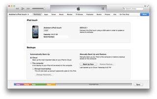 The device options viewer for your iOS devices has been changed up a bit. Managing backups from you computer is easier, and if you hover over different sections of the occupied space of your device at the bottom, you can see how much space it is taking up and how many of the type there is.
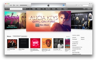
If you don't own an iPad running iOS 6, you, well, would still not call this a big change. The only differences are a new "What's New" reel and an slightly changed colour scheme
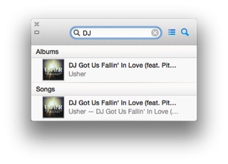 The mini player has been updated, and is even more awesome. When your not controlling your music, it just shows what song is currently playing. But as soon as you roll over the player, you get controls for play/pause, forward/back, and AirPlay. Towards the right, you have controls for UpNext, and a search function to find songs, albums, artists and playlists.
Its a shame to see the iTunes DJ go, as it was a feature I used heavily when having parties at my house, as its actually easier to manage the DJ from the Remote app than it is UpNext, as you need to hold the song you want to add and hit add to UpNext, otherwise it instantly starts the song. It would be pretty hard to teach everyone the new way...
-Andrew
Hey everyone, before this article about iTunes 11 goes any further I'd just like to introduce you to a new writer on the site, Andrew T. He will be writing on the site weekly in the future, and if you have any questions for him, please save them until he has a GeekSlam email address.
And for those wondering, Gadget Show Love Xmas content will begin very soon.
I hope you'll all enjoy the article, and the future content from all of us Geeks.
(editor's note: finish)
Apple have done it again. They have released another awesome release of iTunes to the public. This time, with many redesigns to almost ALL the features.
The content viewer gets a complete overhaul. Just click on your album, and you see a list of all the songs in that album, even if you haven't bought all the songs or they aren't stored on your computer, thanks the the better iCloud integration.
As you will have just seen, different areas of the song list have different colours. It seems to find the most dominate colour towards the left of the album colour to make the album blend in. It then picks the next most dominate colour and uses it to colour the album name and the song names. Finally, it picks the third most dominate colour to change the artist name, the song number and the length of the song. This can be a bit weird for some albums, like the one shown, and you should be able to figure out why...
 The device options viewer for your iOS devices has been changed up a bit. Managing backups from you computer is easier, and if you hover over different sections of the occupied space of your device at the bottom, you can see how much space it is taking up and how many of the type there is.
If you don't own an iPad running iOS 6, you, well, would still not call this a big change. The only differences are a new "What's New" reel and an slightly changed colour scheme
 The mini player has been updated, and is even more awesome. When your not controlling your music, it just shows what song is currently playing. But as soon as you roll over the player, you get controls for play/pause, forward/back, and AirPlay. Towards the right, you have controls for UpNext, and a search function to find songs, albums, artists and playlists.
 Its a shame to see the iTunes DJ go, as it was a feature I used heavily when having parties at my house, as its actually easier to manage the DJ from the Remote app than it is UpNext, as you need to hold the song you want to add and hit add to UpNext, otherwise it instantly starts the song. It would be pretty hard to teach everyone the new way...
-Andrew
Subscribe to:
Comments (Atom)


